Friday 27 November 2009

Holidays!


Norway Holiday, originally uploaded by Lins~.

I'm going on holidays in the mountains!
Four nights of reading, writing, drawing crafting, brunching and spa-ing. Yay!

Wednesday 25 November 2009

Changes, Part 2 (Electric Boogaloo!)

The next craft project on the chopping block is this:

Ripped! Gone! No Longer!

It's a cushion cover that I was making from the 200 Crocheted Blocks book. When I got the book, I loved it so much that I just wanted to make something ... anything ... from it. So I grabbed some random wool and started on a random block. At some point I decided to make 3 more and turn it into a cushion. Then when the weather got really hot, my brain was too fried for complicated patterns. I started to hate it because the yarn was ugly, the block didn't lie flat, and I'd have to sew a backing for it. So it fell by the wayside (literally: it ended up on the floor next to my bed).

Skip to quite some time later, and I was enthusing over the projects in 200 Knitted Blocks book. I wanted to make another project from it so badly, but Sensible Me knew that starting another blanket would just be silly. Not only do I have the Your Chequered Heart Baby Blanket to finish to a deadline, but I also have the Stitch Sampler Bedspread, the Circular Rug and the Lost Dogs' Home Blanket to finish. One of which I started 18 years ago!! (Not the Lost Dogs' Home Blanket, though my conscience twinges whenever I think about it. Yes, it's true. I have craft guilt.) So, no, another blanket is out of the question.

The book had samples for a couple of cushions as well as blankets, and that seemed like a capital idea. After all, I have 2 new couches that are just begging for a little adornment. And if I chose my design and yarn carefully, this could be a project I loved from start to finish. So on the weekend I sat down and designed some cushions:


I had a lot of fun with this - combining drawing, design and crafting. Well, crafting on paper, anyway. Years ago I read about young architects - very rarely do their designs ever get built, but they design anyway for practice and experience. They call it Paper Architecture. I guess what I was doing was Paper Knitting. I may make them one day. I may not. It doesn't really matter. I have to return the book to the library in a distressingly short period of time, so it's comforting to know that I have some-ready-to-go projects stashed away in my Blue Book. (That's just my drawing journal, but lately I've been thinking of it that way because it has a blue cover.)

As promised a while back, here's a photo of the doodle I drew in my Blue Book when the weather was too hot to do anything that required brain power:


It's my first attempt at a 'doodle' style drawing. I really like it. The only negative was that I coloured it in with watercolour pencils, and then it took FOR. EVER. to go over all the details with water and a brush, making sure they dried in between so they didn't bleed. It was a major pain and I gave up about half way through. Next time I think I'll use normal pencils. I added some mandala motifs in there. I want to try doing a full mandala next.


P.S. In an effort to make sure I blog regularly, I actually wrote this post before I even started doing anything about the Former Cushion Cover. I'm eager for blog-love! Really!

P.P.S. The photos today come from the Can't Be Arsed School of Photography.

P.P.P.S. I've started writing a new zine!

Sunday 22 November 2009

Changes

Sorry about the lack of posts lately. I actually wrote this one up at the start of the week and forgotten that I hadn't actually posted it until today. Oooppps.

I mentioned a while back that I wanted to do a major overhaul of my craft projects. Finally, it has begun!

The one-third-finished Mohair Beret from the Cleckheaton book I won at the Knit-In-Public day two years ago?

Why on earth did I ever think I'd wear a beret??

The Heirloom Baby Blanket that I haven't worked on for a year and can't remember what row I'm up to?

What a giant pain in the butt!!

The half-finished Elizabeth Zimmerman Baby Tomten Jacket that I was once so enamoured with?

As if I'd ever finish that, with all those loose ends to weave in!!

That last one was the hardest. I was almost half-way through the knitting. (That picture only shows the beginning - I had actually knitted about 120 rows.) It's a shame to waste so much work. But then I looked at it again and realised it would be ridiculously too big for a newborn baby. That annoyed me. So..... RIP!

I turned the blanket into a jacket, and I turned the jacket into a blanket. That gave me a perverse sense of satisfaction.

I'm still making an Elizabeth Zimmerman Baby Tomten Jacket, but now it's in the Panda Baby Lustre that I was using to make the old blanket. I'm calling it the Snow Elf. I'm using 3.25mm needles instead of 4mm, so it should be much smaller and more suitable for my new niece/nephew.

The Snow Elf, in its infancy.

I still wanted to make a baby blanket, but a simpler, less annoying one. I happened to have a copy of Jan Eaton's 200 Knitted Blocks just lying around. I'd borrowed it from the library on a whim and it just happened to be the perfect book for what I wanted to do. Serendipity! The great thing about this book and its sister 200 Crocheted Blocks is that you're basically designing your own piece. Along with the 200 patterns (each of which is for a 15cm square), there is a section on combining textures, colours and shapes, and one on sewing them together and finishing them with various edgings. The sample blankets are amazing and quite drool-worthy, but the way they are presented - not as a finished blanket, but as a series of squares next to each other - reminds you that it's really your choice to combine the squares in any way and any colour you choose. It was very exciting! I chose Block No. 17 Checks and Block No. 83 Heart In Frame, and designed the Your Chequered Heart baby blanket.

The first block off the rank.

I will have to knit 36 squares, sew them all together and add an edging. It's a little daunting, but it's a hell of a lot less daunting than that white, lacy, double-stranded nightmare on circular needles and bristling with stitch markers that I was confronted with before. I actually do like the Henry's Baby Blanket pattern, but my head's just not in a place where I can cope with it. I'd like to give it a go one day, though.

Finally, the old beret is now this:

Fuzzy!

It's a skinny scarf that's *very* loosely based on one I saw on Etsy. The original is knitted, not crocheted, and it's made sideways, not lengthways, and it has even ends, not a stepped ends, and it's orange, not pink. So yeah, I can see the resemblance! I'm pretty happy with how mine turned out. The only disappointment is that it's way too hot to wear a mohair scarf now. But come winter, I'll be all scarfed up!

Friday 6 November 2009

Two new techniques for the price of One!

Well, three new techniques when you think about it.

It's been all about my art journal the last couple of weeks. I've been getting all excited about it. Here's my latest page:

Wabisabi. Acrylic paint, gel medium, spreader medium, vellum, textas, ink pen.

I discovered Leslie Herger recently and her technique for backgrounds: Sharpie Ghosting. Basically you take advantage of the fact that alcohol-based inks will bleed through paint applied over the top to create ghostly-looking writing that can be used as a background. On the left-hand side, I used three different colours of Sharpie on top of each other, going in different directions, as in the tutorial. I copied down random phrases from a TV show I was watching at the time. On the right-hand side I already had a purple-coloured background, so I just laid down one layer of writing, using my pastel [brand]. On this side I copied a passage from a book on Zen Japanese Stone Gardens that I'm reading at the moment. I covered both sides with a layer of plain white gesso paint, and was amazed at how the coloured inks magically appeared as the paint was drying. (If this had happened accidentally, I imagine I would have been pretty pissed off, but as it was deliberate, I thought it looked cool.)

Having laid down this really cool background, I didn't want to cover it up with collage, and was hesitant to even do a drawing over it. So I thought I'd try a gel medium transfer. I'd heard about these ages ago, but was too scared to try them. Many of the instructions seemed to involve dunking your whole artwork in a vat of water, and there were horror stories about either the image or the base being totally ruined. But I was feeling brave! I found some good instructions by Paul Fujita here and a video here.

So - a gel medium transfer involves applying a gel medium to an image on a piece of paper, gluing it to your artwork and removing the backing paper, therefore transferring the image to your artwork. As the name implies! The image can be a photocopy, a printout from an ink jet printer, or a page from a magazine. The thing about transfers is that you don't have the hard edges that you get from a collage, and the background shows through any light areas. Making them unbelievably cool!

Wabisabi. Transfer on left page.

I did the one on the left first. It's sourced from a book I'd photocopied a few years ago when I was collecting pictures for a zine I was writing. I kept the spares just in case. Supposedly fresh photocopies work best, but I had no issues with this at all. Once the backing paper was all stuck down and completely dry, I then had to wet my finger slightly and rub at the paper until it came off in little pills. I had to rub and rub and rub! I tried using different tools - an eraser, scrunched up paper towel, a sponge - but they all took off sections of the gel medium (hence the big hole in the middle). So I went back to using my finger. I'm telling you, by the end of it, my fingertip was all red and sore! But I was so excited, I just kept going and going. My finger still hurts, but I regret nothing.

Once the transfer was done, I sanded it slightly as it felt very rough. Then I sponged a light layer of orangish-yellowish acrylic mixed with glaze medium over the whole double page, to unite both halves. The glaze brought out the ridges and brushmarks in the layer of paint below. I love this! In trying to decide what to do with the other half, I thought, screw it! I'll just put in another transfer! (By this time it was a few days later and my finger had had a little time to recover.) I chose an image from the same book I'm reading on Zen Japanese Stone Gardens. Wanting a subtle effect, I chose an image with a yellow background to match my background rather than a photo of greenery (it's a page from an Edo Period gardening manual); I scanned it and printed it. Then I glued it on down and went to work!


As I was working on this section, the concept of wabi-sabi kept coming to mind. There was a definition in the book, so once the transfer was finished, I wrote it in next to the transfer. I used rubber stamps to stamp the word across the top in a subtle lavender colour that echoes the purple background which peeks through at the edges on the right-hand side. (Which I'd first laid down a long time ago, before any of this was even thought of. Concepts of impermanence, change and time passing are starting to weave into this page, too. One thing I love about art journalling is that when I lay down the first background of a page, I'll usually have no idea what it will end up as, or even how long it will be before I go back and work on it again.)


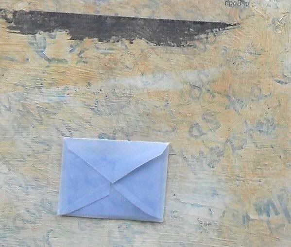
The final touch (and the third technique) is a tiny envelope made of blue vellum with a little note inside. I bought some packets of different coloured vellum from ebay last week. I didn't realise it would be so stiff and thought it would be more transparent, like the envelopes that postage stamps are kept in. Oh well, I thought I'd use it anyway. I made the envelope from a template I found online and printed it out way too small. But I kind of like it that way. The note just records that the image is a painting is by Vincent van Gogh and the date; I couldn't really think of anything interesting to write. In the future though, I'd like to use envelopes to hold pieces of ephemera and 'secret' notes to make my journal more interesting to flip through once it's finished.

I'm glad I finished the page on Saturday, because the last few days have been so hot that I haven't felt like doing anything. Normally I try to be philosophical about the heat, but I've had bad hayfever too, and that's a recipe that just adds up to grumpiness! Last night I started doing an easy doodle to keep my mind off how I'm feeling. I'll show you that once it's finished.

Keep cool, everybody!


P.S. Thanks for bearing with me, with these long, detailed and probably very boring descriptions of my art journalling. I'm mainly using them as a record for myself of what I've done, as well as a writing exercise to keep my brain busy.

Sunday 1 November 2009

Recent Art Journal Pages

I started this page ages ago by impulsively scribbling down the Shakespeare quote. A long time later, I used gel medium to glue down torn strips of a photocopied page of a story I'd written. I still had no idea what to do with it. Much later again, I decided to try out my new acrylic spreader medium on it. When mixed with acrylic paints, it turns the medium into a transparent glaze. I used it with navy blue and a little silver, and sponged it liberally all over. Then I went over the quote a few more times with greylead and purple pencil to make it stand out a little more (but not too much - I wanted it to have a shabby, mundane look). I was tempted to add more elements, but I decided to leave it there, with a slightly minimalist (for me) look. The gel medium I'd added previously and slopped about without really thinking about it created an unexpected batik effect when I added the thinned navy paint over the top.
The page went from one I felt very ambivalent about to one that I really quite like.

What A Piece of Work. Photocopied text collage, gel medium, pencil, acrylic paint in spreader medium.

This page really has two different topics, but I bound them together visually using my new aqua blue acrylic paint. I don't really like the composition of the collage - that's something I feel I need to work on. I do like the drawing and juxtaposition of the heart element with the writing. This is when I started to realise that it would be fun to collect receipts and other scraps that I would otherwise have thrown away, and use them as mementos of a particular occasion.

I Want A Holiday / Visit from Mum. Magazine image, wrapping paper and ephemera collage, acrylic paint, metallic rub, pen.

As you can see, I'd been using this page to practice calligraphy. I didn't want to waste the rest of the page though, so I used the striped paper scrap to separate it from the rest of the page. I'd started out laying down light blue paint vertically; I added the dark blue oil pastel horizontally to suggest the ocean. The sails are a nod to the Sydney bay paintings of Brett Whiteley - I wanted to convey a sense of space, sunlight and heat. (I've obviously been yearning for the Spring that the local weather hasn't yet been providing this year.) I added green glitter glue to suggest the ocean swells sparkling in the sunlight.
I don't normally use quotes in my journal, but I added a few lines from a song that's been stuck in my head a lot lately.

Into The Blue Sea. Paper and ephemera collage, acrylic paint, oil pastel, felt-tip pen, glitter glue.

Here is a shot of the outside of my journal. I've only used about 10 pages, but it's starting to look obese already. That's inevitable when you're adding thick paint and glued-in papers to nearly every page. I've starting thinking about cutting out some of the central pages to even it out a bit.

On The Edge.

I did this page earlier today. It's in a new journal that I've started which is for when I want to concentrate on practising drawing with little to no paint, or I want to document something in my life, like the meal that I cooked on Thursday night:

Dirty Rice. Pen, watercolour.